
Mythos: Cap, Step by Step, Part 2
Thursday, July 24, 2008
Labels: Digital Color / Mythos / Step by Step / Technique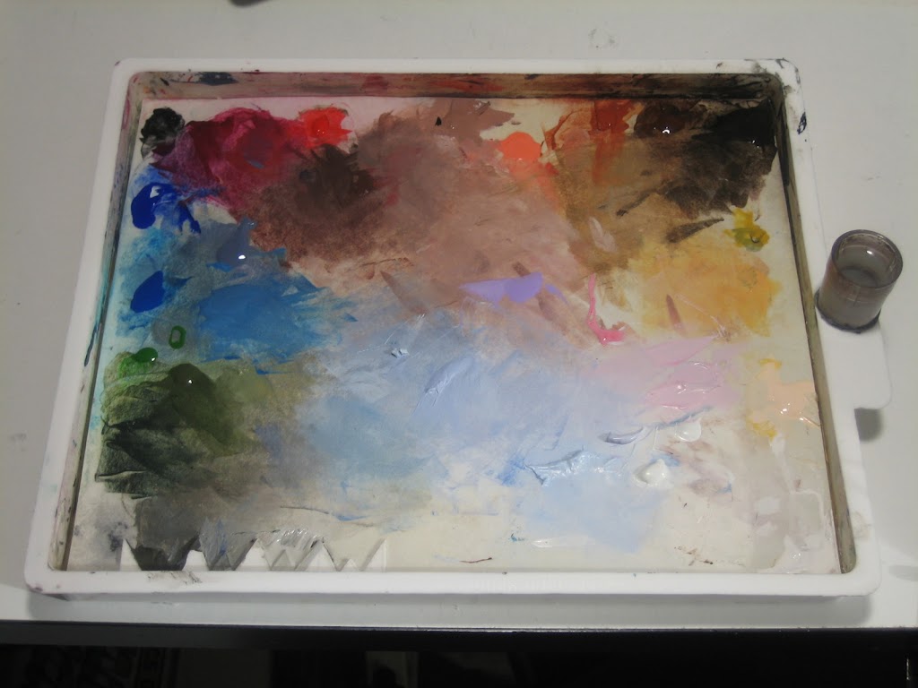
At the end of the last post, we were left with a fully executed penciled page, but with no color. Today we will look at the process of painting that page, panel by panel. In this case, I decided to start with panel 2. Who doesn't like airplanes?
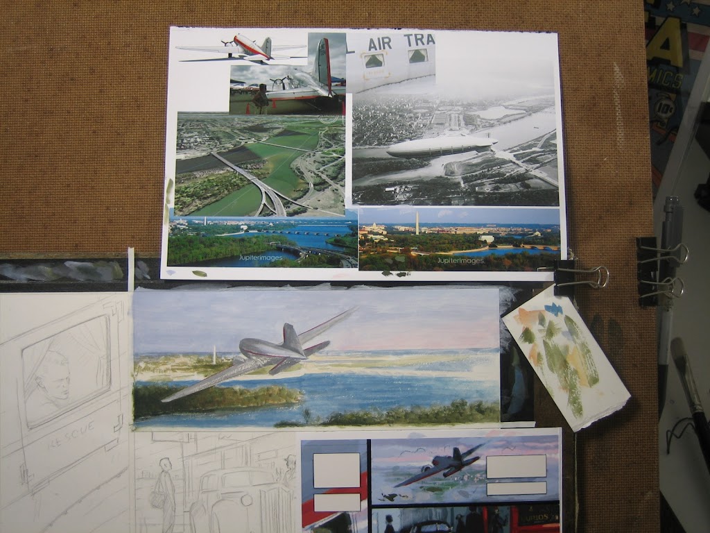
Surrounding the panel, you can see the pertinent reference as well as a paper scrap covered in paint. The scrap is used to gauge the feel of the paint on my brush and is more important than most might guess. It acts as a testing ground that allows for more predictable results on the actual painting. This is where I decide whether I need more water, if I'm using the right color, or even if the brush is in good form. Below that is a printout of my digital color study. I often use this in the same way, painting right on the print to ascertain color relationships.
Because the scene is not complicated, I dive right into painting in full color. As you will see next week in the last two panels, I sometimes wait until I've completed a monochromatic underpainting.

I don't really have a strict method of attack. I just paint whatever grabs me at the moment. However, the main reason I can do this is because the creative color work has already been done in the color study. I'm simply filling in shapes at this point.
I should also mention what I'm using. The palette in the first photo is the Sta-Wet Pallete, which I have posted about previously. My main brushes are the Winsor and Newton Series 7 watercolor brushes, sizes 2 and 6. I sometimes use a bristle filbert brush for larger areas. I have many different sizes and brands for this, so I just go for whatever feels right. The only way to get that feeling is to experiment.

I get almost all of my reference from the internet. A quick Google image search finds most of what I need, but sometimes I check various stock photo sites if I need something specific. One of the "photos" among the group is actually a screen shot from Google Earth, which I often use to compose relatively accurate portrayals of geography. I wanted to show the Washington Monument in the background, since I thought it would be the only recognizable architecture from the air (in a panel with limited space). I happened upon one photo of a dirigible in that area which revealed that one of the bridges I was about to paint didn't exist in 1940.
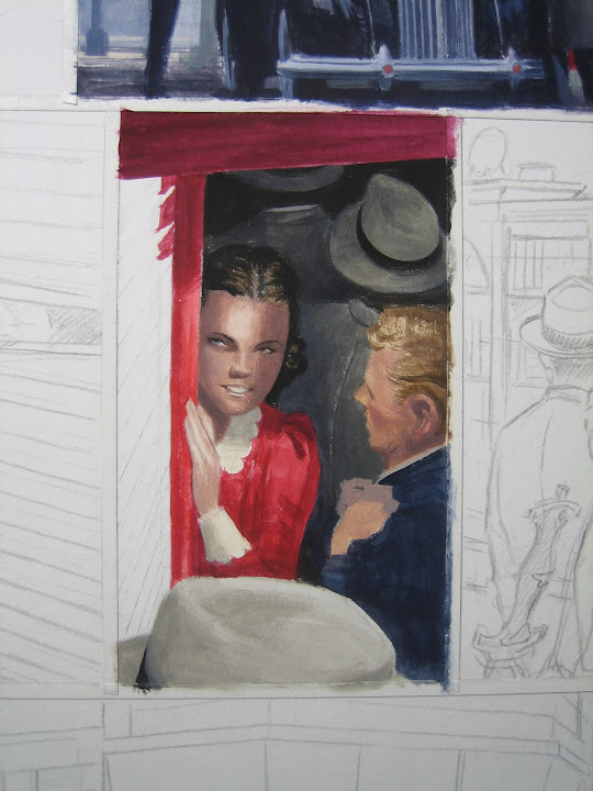
Most often, reference is used to ascertain the structure of specific objects or settings. For most of my figures, I tend to use myself, my friends, and my (trained) imagination. Everyone is too well connected these days to try and swipe a pose from an existing photograph. That being said, People have been drawing people for thousands of years, so I'm not too critical if I see similar takes.

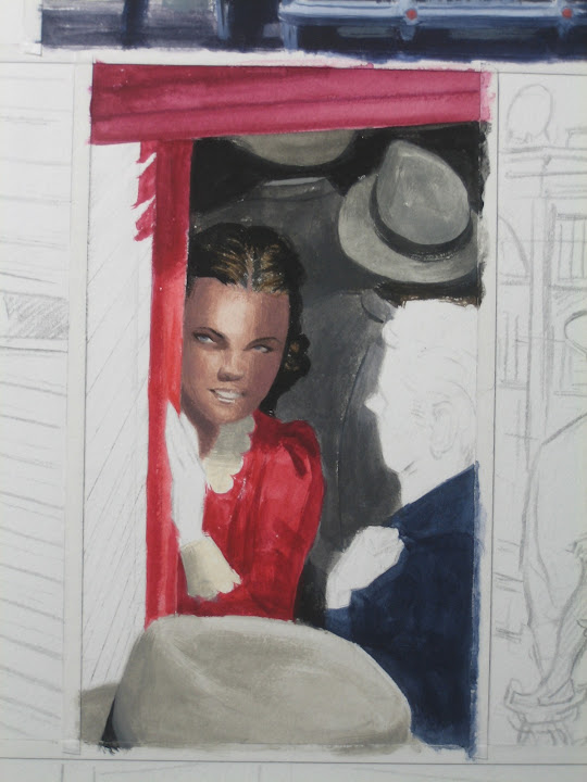
Here, I had my girlfriend pose for me. She looks nothing like the character I ended up with, which was based on the Jack Kirby art from the origin. The point is to glean. When I look at reference, I don't blindly copy it. Rather, I use it to more fully understand the subject of my drawing or painting. In this case, I took the lighting information and the general gesture, while ignoring facial features. I wasn't completely happy with the way the character turned out, but I'll show you a post-production trick that solved it at the end of this feature.
The young man, Steve Rogers, was based on the maquette I had sculpted earlier. I eventually took his hand out of the composition because I decided to get rid of the bag he was carrying in the third panel.
Finally, a note about the paint. By this time (January) I was slowly adding more and more gouache to my Holbein Acryla Gouache, which is simply acrylic paint that dries to a matte finish. The transition allowed for effects closer to oil paint since straight gouache never really dries. This is great for painting flesh and skies, which require more subtle shifts in color to simulate our perceptions. My current method revolves around gouache for my most common colors: black, white, sepia, and grey. I then mix in the Acryla Gouache for my saturated hues which are most often used in low concentrations. The end result is a painting with very low amounts of acrylic.
We'll continue this next week with the remaining panels, but let me know if you have any questions in the meantime. Have a great weekend!
Update: Part 3
Hey man, thanks for posting something like this, it's always really interesting to hear the thoughts on another artist's technique, no matter what media they work in. I give you a ton of credit for working in acrylic/gouache, I'll stick to my oils ;)
ReplyDelete..for now.
Very cool.
ReplyDeleteI'm digging this step-by-step process.
Thanks for posting it.
Off topic... but congrats on the Marvel exclusive deal!
ReplyDeleteThanks for these posts, too. It's fascinating to read through this.
LOVE these! Man u give so much! Many thanks helps alot!
ReplyDeleteThanks! Glad they could provide some guidance!
Delete