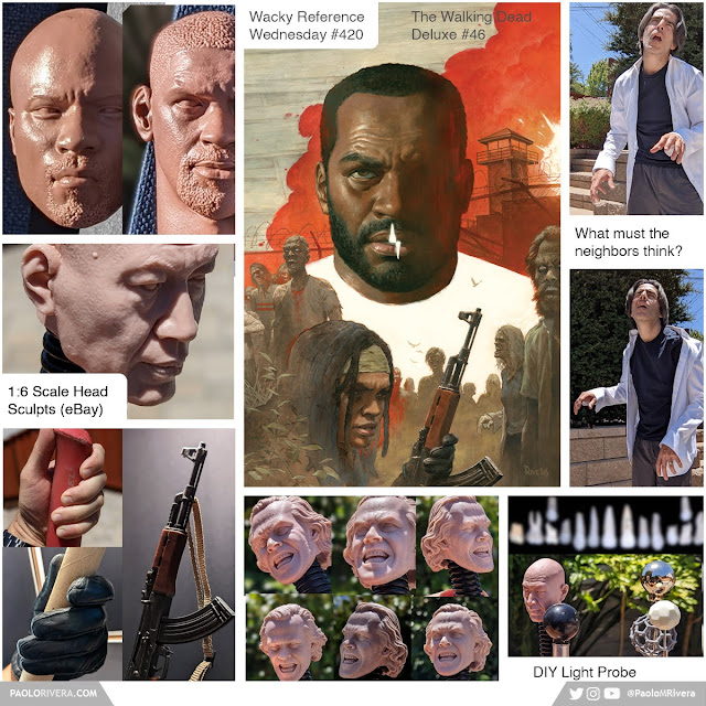
Wacky Reference Wednesdays, No. 420
Wednesday, October 19, 2022
Labels: Covers / Painted / Wacky Reference Wednesdays |
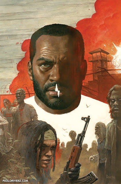
| THE WALKING DEAD #46 VARIANT COVER. 2022. Gouache & acrylic on illustration board (w/ digital edits), 11 × 17″. |
This cover was tough for a couple reasons. By this point in the series, I had already established the main visual theme, that of pure white as a representation of something lost. Sometimes that was teeth, other times, bullets. (For those of you who are behind, spoilers below...)
All my initial sketches involved a missing head, but I wanted to give Tyreese something with a bit more dignity. Late one night, it occurred to me that I could just flip it — I could paint a nice, stately portrait of him, but make it look like he was just wearing a white t-shirt. And after re-reading the issue, I thought the teeth would be a disturbing addition that would serve as a call-back to the first cover, as well as create a bit of mystery for those unfamiliar with the events.
 |
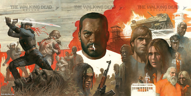
| #45-47, as planned |
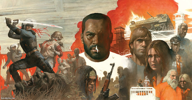
Now for the rookie mistake. This was the 4th of 6 connecting covers and by this time I had an enormous Photoshop file where I could pencil new covers perfectly aligned with the finished ones. The only problem was that I hadn't been accounting for the overlap necessary for artwork that's trimmed on both sides.
 |
| #45-47 after edits |
The production team had been making up for that mistake by overlapping them for me (with a bit of Photoshop massaging). But by the time we got to this issue, the gap was getting too big. My normally patient editor emailed asking for some truly last-minute edits. I ended up having to slash a zombie to shift the artwork, but it wasn't a big loss. That kind of surgery would've been much more difficult on the following cover, filled with main characters... and more floating heads.
.jpg) |
| early digital roughs |
 |
| original art |


No comments :
Post a Comment