The Baxter Building
Sunday, January 6, 2008
Labels: Mythos / Penciled / Perspective / Photoshop / Technique
The Baxter Building, headquarters of the world famous Fantastic Four, was featured on a couple blogs recently, so I thought I'd post some details and process pics of my take on it. Boingboing referenced a post on Arglebargle that covered some of the history behind the various renditions. Pictured above is my version, accompanied by the intended typeface and labels (for reasons unknown to me, another version is what saw print).
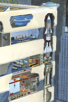 My favorite section is pictured here. With the most vibrant color, intricate cutaways, and to top it all off, a rocket, this portion of the composition was where I started my journey. I can't exactly gauge how long I spent on the total image, but I'd imagine it was hundreds of hours. I started before I even had a script for Mythos: Fantastic Four, but didn't finish it until the very end.
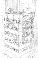 This is the pencil stage, just prior to painting. I treated this illustration just like any other painted page, so it's the same size and material: 11" x 17" Strathmore Series 500 3-ply Bristol Board, vellum finish. Using the perspective grid pictured below, I traced my enlarged preliminary sketch to the appropriate size and proceeded to detail each section of the building.
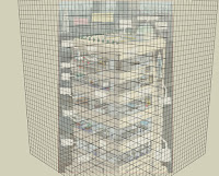 This is a perspective grid I set up using Google Sketchup, a program I've been using more and more often to create backgrounds. In this case, I imported my rough color sketch into the program using the "match photo" feature, an ingenious process by which you can sync a given 3 dimensional space to your 2 dimensional picture using various revealing details.
For instance, you can move vanishing points, horizon lines, or simply grab the lines in the 3D space to match the angles of rectilinear forms in your picture or drawing. For the Baxter Building, I used the program to create a perspective grid of squares in space, but as of late, I've actually been building environments so I can more easily stage complex action scenes, not to mention try more challenging points of view.
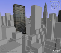 This location shot is courtesy of Google Earth. Marvel gave me the exact Manhattan address for the Baxter Building, so I was able to place it in a real-world setting. Using Google Sketchup's 3D warehouse, I was able to find detailed models of some key buildings within the context of midtown. This allowed for a more realistic setting for such a "fantastic" building.
 The "3D Buildings" feature gives the stark, grey approximations of the heights and shapes of architecture pictured here. The remaining buildings were pieced together from various reference on top of the perspective structure provided from these forms. While not exact to the last detail, in combination with recognizable landmarks, it makes the entire composition more believable.
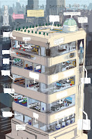 This image was created in Photoshop by coloring over a rough sketch. This is the stage where I get the best sense of what the overall "feel" of the final image will be. Because of creative payoff, it is often my favorite stage. The rest of the process, though extensive and time consuming, is really just the execution of ideas that were formed at this stage.
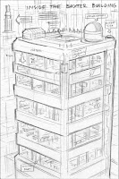 And finally, this is where it all began— a simple 4" x 6" pencil sketch that gives a basic idea of the composition and point of view.

Ha! That's probably the nerdiest thing I've seen in a while. It's soooo......AWESOME!
ReplyDeleteAbsolutely amazing.
ReplyDeleteGreat stuff!
ReplyDeleteI've heard more and more illustrators recommending sketch-up for lighting set-ups. Any recommendations on getting started with it? Good web tutorials or anything similar? I've downloaded the software but quickly frustrate myself when trying to use it.
Thanks, guys!
ReplyDeleteBen, with regard to Sketchup, I just used the built in help menu and tutorials. That being said, I only build the most basic of shapes. I haven't actually used it for any kind of lighting information. I think it has some limited ray-tracing capabilities, but I believe you must export the files to another program in order to do any kind of heavy rendering.